
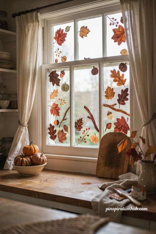
Here’s something you probably haven’t considered: the fastest, cheapest way to make your home feel like fall isn’t a wreath or a pumpkin display — it’s a window that hasn’t been touched since spring. A little removable paint or a few window markers can turn ordinary glass into one of the most noticeable seasonal details in the whole house, and you don’t need to be an artist to pull it off. Simple shapes, layered in warm autumn tones, do most of the work on their own. Whether you want something bold enough to catch a neighbor’s eye or subtle enough to just warm up a kitchen window, there’s a version of fall window painting ideas here that fits. Grab a brush and let’s get into it.
1. Fall Leaf Cascade
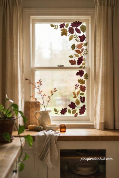
A cascading border of leaves along one side of the window adds color without swallowing the whole pane, which makes it a good starting project if you’ve never painted glass before. Mix burgundy, amber, and muted gold, and vary the leaf sizes so the border feels like it drifted there naturally rather than being stamped out in a repeating pattern. Keep the center of the glass clear so daylight still comes through unobstructed. This one works especially well against warm neutral walls or curtains, since the leaf colors pick up on tones already in the room instead of clashing with them.
2. Painted Pumpkin Border
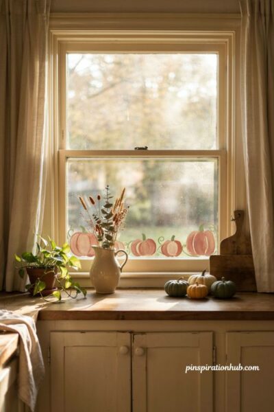
A low pumpkin border across the bottom of the window keeps most of the glass open while still reading as unmistakably fall. Use a mix of terracotta, cream, and sage rather than sticking to one orange shade, since the variation gives the design more depth at a glance. Paint each pumpkin a slightly different size and shape so the row doesn’t look like it was traced from a stencil. Thin connecting vines tie the pumpkins together visually without adding extra visual weight, which keeps the whole border feeling light rather than cluttered.
3. Harvest Moon Silhouette
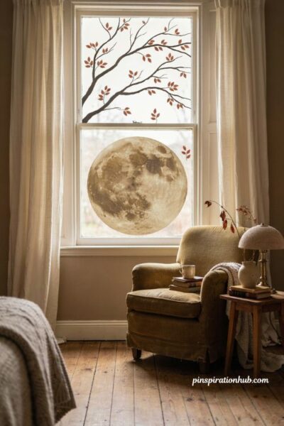
If bright orange isn’t really your style, a harvest moon scene gives the same seasonal feeling with a moodier, more artistic edge. One large muted moon becomes the focal point, with a few dark branches and copper accents doing the rest of the work around it. Stick to a handful of strong, simple shapes rather than a busy scene — the fewer elements you use, the more polished a beginner painting tends to look. This design suits bedrooms or reading nooks especially well, where a deeper, quieter color palette already sets the tone.
4. Birch Window Forest
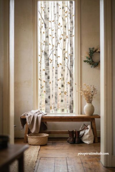
Painting a row of birch trunks straight up the glass is a clever trick for narrow or tall windows, since the vertical lines make the whole frame feel taller than it actually is. Stick to white bark with charcoal markings and a scattering of gold leaves, which keeps the palette to just three colors and easy to coordinate with whatever’s already near the window. Vary the trunk widths and spacing so the row doesn’t end up looking like a striped pattern. This one is especially effective in entryways, where guests tend to notice small seasonal details first.
5. Autumn Floral Arch
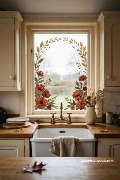
For a softer, less pumpkin-heavy take on fall, an arched border of rust flowers, golden stems, and sage leaves frames the window instead of covering it. The arch shape naturally draws the eye toward whatever view sits beyond the glass rather than blocking it, which makes it a nice option for a kitchen window over a sink. Put your fullest flowers near the bottom corners and let smaller stems taper off as they rise. The result feels more like decorative framing than a themed mural, which reads as more refined without extra effort.
6. Acorn Branch Corners
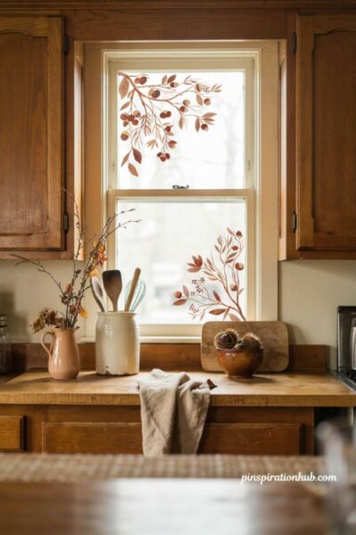
Small acorn and chestnut clusters tucked into just the corners of a window bring a woodland feel without asking for a full mural’s worth of paint. Stick to caramel, rust, and warm cream tones, which blend naturally with wood cabinetry and butcher block counters in a kitchen. Concentrating the branches near the corners keeps the center of the glass bright and unobstructed, so the design still feels functional and not just decorative. It’s one of the lower-effort ideas here, but it still reads as intentional and seasonal.
7. Painted Autumn Plaid
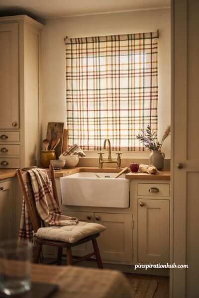
A painted plaid pattern gives a window that cozy, fabric-like feeling without adding a single extra textile to the room. Use muted rust, mustard, cream, and olive for the grid, and space the lines generously so daylight still filters through instead of getting blocked by a dense pattern. Thin, tightly packed lines tend to look heavy on smaller windows, so err on the side of more space between them. This design pairs beautifully with plaid throws or pillows already in the room, since the window essentially becomes another textile.
8. Golden Wheat Stalks
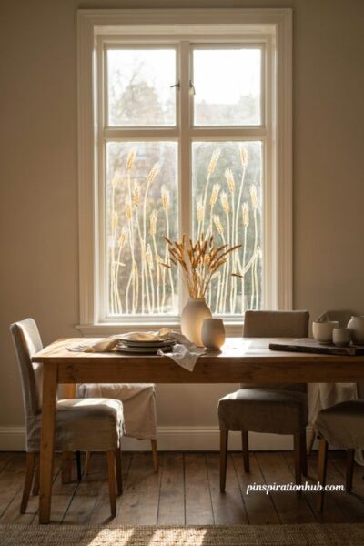
Tall wheat stalks painted in honey gold and cream bring elegant, upward movement to a plain window without leaning on pumpkins or bright orange at all. Start the stalks at slightly different heights across the glass so the row reads as natural rather than perfectly repeated. This design works especially well in dining rooms, where you want a seasonal touch that still feels a little more formal than a cartoonish harvest scene. The narrow shape of each stalk also keeps the overall design light, so it never feels like it’s crowding the window.
9. Ginkgo Leaf Drift
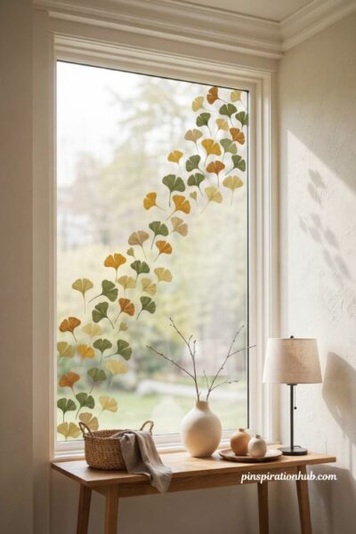
Scattered ginkgo leaves drifting diagonally across the glass give a cleaner, more modern take on fall than a traditional leaf border. The distinctive fan shape of each leaf creates visual interest even with a small amount of paint, and mustard and olive tones keep the palette seasonal without going overboard. Leave generous space between each leaf so every shape reads as intentional rather than crowded together. This one works particularly well in a modern entryway or hallway, where a full mural would probably feel like too much.
10. Woodland Fox Scene
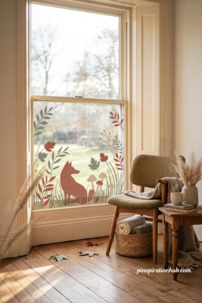
A simple fox silhouette tucked among grasses, leaves, and tiny painted mushrooms adds personality to a window without tipping into full cartoon territory. Keep the scene along the lower portion of the glass so plenty of natural light still comes through above it. Stick to muted sage, russet, copper, and cream so the fox feels sophisticated rather than childish, even in a sunroom or kids’ space. This design tends to surprise people in the best way — it’s whimsical, but still coordinated enough to fit an otherwise adult home.
11. Pumpkin Vine Frame
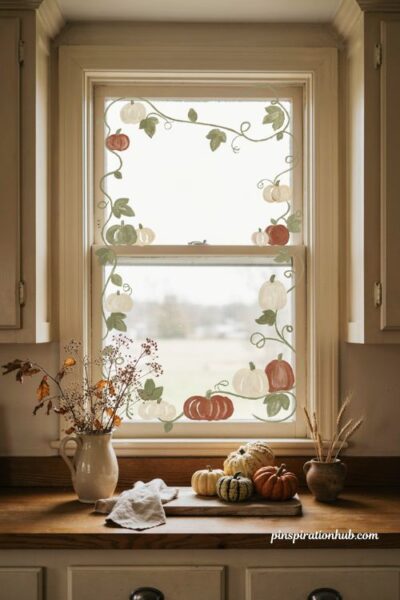
Instead of a straight pumpkin border, let a painted vine climb loosely around the window frame, with pumpkins of different sizes tucked in along the way. Paint the vine line first, then add the pumpkins afterward so their placement feels natural rather than evenly spaced and stiff. Cream, rust, and sage pumpkins soften what could otherwise be a very bold, single-color design. Leave a little breathing room between pumpkin clusters and avoid outlining every shape too heavily, since a lighter touch keeps the whole frame feeling airy.
12. Apple Branch Sweep
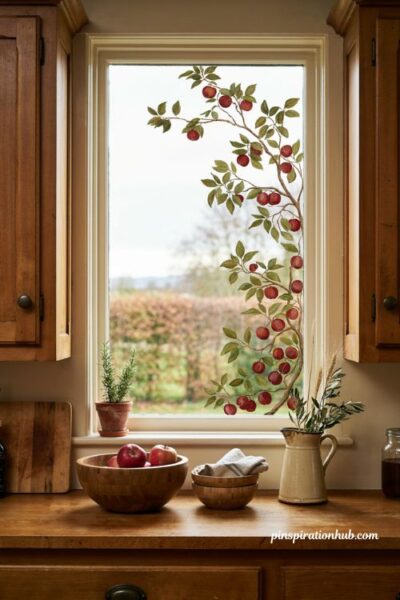
An apple branch design brings harvest color to a window without repeating the pumpkin motif that shows up everywhere else. Sweep red apples and olive leaves along slim brown branches across one side of the glass, placing the heaviest fruit clusters near a single corner rather than centering everything. That asymmetry makes the branch feel like it’s actually growing rather than pasted on symmetrically. This one looks especially good near a kitchen with wood bowls or a fruit basket nearby, since the colors echo what’s already sitting on the counter.
13. Lantern Glow Window
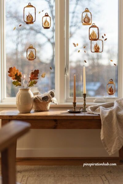
Painted lanterns with soft gold flames and bronze frames make a window feel warm well before you ever light a real candle. Scatter a few tiny falling leaves around the lanterns to tie the design back to the season without adding a whole separate motif. Layer your yellows and ambers rather than using one flat color, since the layering is what actually creates a believable glow effect. This idea reads beautifully from outside the house too, which makes it a strong pick for a porch-facing window or sunroom.
14. Oak Garland Frame
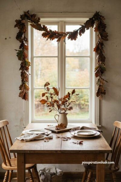
A loose oak garland framing the edges of a window brings rich fall color while still feeling classic rather than themed. Layer brown, rust, and muted green leaves with small overlaps and varied angles, since a stiff, evenly spaced border tends to look more like a stencil than a garland. The gentle, draped curve of the design softens the hard straight lines of most window frames. This one suits dining rooms and hallways particularly well, where a classic, understated look fits better than something bolder or more playful.
15. Maple Wreath Circle
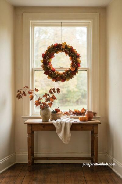
A circular wreath painted directly onto the glass gives a window one clear, unmistakable focal point instead of scattering the eye around the whole pane. Sketch the circle lightly first to keep it balanced, then build up maple leaves, tiny berries, and a couple of miniature pumpkins in loose layers. Cream berries help soften what could otherwise be an overwhelming amount of warm rust and orange in one spot. This design pairs naturally with an actual wreath or garland nearby, since the painted version essentially echoes what’s already hanging on the door.
Final Thoughts
So which window in your house has been staring back at you, plain and un-decorated, since sometime back in July? That’s probably your best starting point — pick the room where you spend the most time, or the window guests see first when they walk up, and try just one of these designs before committing to more than that. A removable paint or window marker means there’s very little risk in testing a style you’re not sure about yet. Once you see how much personality a single painted window can add, it’s hard not to start planning the next one.
Frequently Asked Questions
Q: What kind of paint should I use for window painting? Removable, window-safe paint or specialty window markers work best, since they wash off easily with warm water or glass cleaner when the season ends.
Q: Will painted designs block light from coming through my window? Not if you keep the design along the borders or corners and leave the center of the glass clear, which most of the ideas above are built around.
Q: Can I paint on the inside of the window instead of outside? Yes, painting from the inside is common and often easier, though outside designs tend to look crisper to passersby since there’s no glass reflection to work around.